

Introduction: Why Color Psychology Shapes Every Click and Emotion
In web design, every color communicates a message and emotion. Color psychology is more than choosing appealing shades—it’s about shaping user perception and influencing behavior. It determines how visitors connect with a brand, make decisions, and remember experiences. Designers who understand this can turn visuals into emotion-led storytelling.
The psychology of colors blends emotion and strategy to guide user journeys naturally. Through subtle contrasts and harmonized palettes, it enhances engagement and directs attention. Moreover, it transforms digital interfaces into memorable experiences that feel intuitive and human.
When applied effectively, color psychology builds trust, empathy, and brand recognition. It gives brands the power to evoke meaningful feelings that align with their identity. Every hue becomes a strategic tool to encourage action, foster connection, and deepen user relationships.
In this article, we’ll uncover seven game-changing roles of color psychology that redefine how designers create meaningful, high-performing, and emotionally intelligent web experiences.
Building Emotional Connection: The Heartbeat of Color Psychology
A great website doesn’t just function—it feels alive. Through color psychology, designers create emotional depth that transforms browsing into a personal experience. Colors silently shape mood, trust, and focus, guiding how users respond before they read a single word. When chosen intentionally, hues evoke empathy, helping brands form authentic emotional bonds that drive loyalty.
Additionally, color acts as the emotional bridge between users and digital storytelling. Every tint, contrast, and gradient defines tone—calm, playful, or professional. When fused with digital transformation principles, color becomes a strategic emotional tool, blending technology and human perception to make interactions meaningful and memorable.
Warm vs. Cool Tones: Designing for Emotional Balance
Warm tones like red, orange, and yellow create energy and spark enthusiasm, motivating users to explore or act. In contrast, cool tones such as blue and green promote stability and calm, making them ideal for corporate or wellness platforms.
However, emotional design depends on equilibrium. Too many warm tones can overwhelm, while excess coolness may detach the audience. By understanding the psychology of colors, designers craft palettes that feel inviting yet balanced, encouraging comfort and curiosity in equal measure.
The Impact of Neutral Shades on Emotional Stability
Neutral colors such as white, gray, and beige deliver balance and clarity. They act as emotional stabilizers, softening vivid palettes while ensuring a professional, modern tone. Moreover, they provide visual breathing space, improving focus on content and hierarchy.
Designers often use neutrals to anchor brand identity, framing emotional hues elegantly. When applied with care, these shades establish harmony and trust, allowing websites to appear refined and approachable at once.
Mapping Emotions to Color Choices
Every color triggers instinctive human reactions. Red suggests urgency, blue conveys confidence, and green symbolizes growth and renewal. These associations allow brands to communicate emotion instantly and powerfully.
By leveraging color psychology, designers transform palettes into behavioral cues that inspire interaction. For example, retail pages might energize users with bold hues, while service sites rely on calm tones to build reassurance. Each color becomes a deliberate emotional choice that shapes how users connect and convert.
Storytelling Through Harmonious Color Flow
Color harmony drives emotional storytelling across the digital journey. Through smooth gradients, balanced contrasts, and rhythm in tone, designers can lead users from curiosity to confidence naturally.
Furthermore, coherent color flow strengthens brand recall and visual rhythm. When guided by the psychology of colors, design becomes a narrative experience, not just a visual one—inviting users to feel every scroll and interaction as part of a brand’s ongoing story.
Strengthening Brand Identity: The DNA of Visual Consistency
A brand’s personality is expressed through color before a single word appears. Color psychology turns simple shades into emotional identities that shape recognition and trust. When users repeatedly encounter the same color cues, they subconsciously connect them with the brand’s promise and reliability. This visual consistency builds credibility and recall, making the brand instantly familiar.
Moreover, the psychology of colors transforms logos, buttons, and backgrounds into emotional anchors. Every hue reflects a message—confidence, passion, innovation, or calm. By maintaining visual unity across touchpoints, designers reinforce a coherent brand voice. Consistent color use, supported by professional software service design strategies, ensures every element contributes to a cohesive and emotionally resonant identity.
The Psychology of Colors in Brand Communication
Each color tells a story about a brand’s values and tone. Blue conveys dependability, red evokes energy, and green suggests growth. These associations help companies express their character at a glance, creating emotional alignment with audiences.
When brands apply color psychology strategically, they turn abstract emotions into clear visual narratives. A technology company might rely on calm blue for trust, while a creative studio chooses vibrant orange for innovation. Therefore, color acts as both a differentiator and communicator, making brand messaging more human and memorable.
Consistent Palettes Across Digital Platforms
Consistency across web, mobile, and print channels is essential for brand recognition. A unified palette ensures every user interaction feels familiar and professional. Through color psychology, designers sustain emotional continuity no matter the medium.
Transitioning between platforms smoothly strengthens audience loyalty. For instance, matching web and mobile hues improves perceived reliability. By maintaining palette integrity, brands build trust and visual rhythm, reinforcing their emotional essence. This consistency keeps messaging aligned even when the user experience evolves across different interfaces.
Minimalism and Focus: Avoiding Color Overload
Simplicity enhances emotional clarity. Overusing bright or clashing tones can create noise that distracts users from key actions. Color psychology supports minimalism by emphasizing hierarchy, contrast, and focus where it matters most.
Designers who apply restraint direct attention with intent. Using a limited palette promotes a sense of balance and sophistication, allowing users to connect with content effortlessly. A minimalist approach conveys confidence—showing that the brand understands precision and emotional control in its visual language.
Modernizing Brand Palettes Without Losing Heritage
As brands evolve, refreshing color schemes keeps them relevant without erasing history. The psychology of colors helps balance innovation with legacy, ensuring updates enhance emotion, not erase it.
For instance, subtle shifts in tone can signal progress while maintaining familiarity. Designers can modernize palettes by introducing gradients or secondary hues that complement existing visuals. Through thoughtful adaptation, brands preserve authenticity and emotional continuity, proving that change can strengthen rather than disrupt their identity.
Enhancing User Experience Through Visual Hierarchy
Great design isn’t only visual—it’s directional. Color psychology helps designers control where users look first, what they feel next, and how they move through a page. By mastering contrast, balance, and harmony, they can build intuitive flow that guides users toward the most important elements.
Moreover, colors influence how quickly users understand structure. When applied strategically, hues highlight calls-to-action, categorize content, and simplify decision-making. This thoughtful use of color, combined with modern practices, creates websites that feel natural, accessible, and emotionally engaging.
The 60-30-10 Rule: Designing Harmony in Hierarchy
A proven formula for balance, the 60-30-10 rule ensures visual order and consistency. It divides colors by dominance:
- 60% – primary color for overall mood and background
- 30% – secondary color for structure and contrast
- 10% – accent color for highlights or CTAs
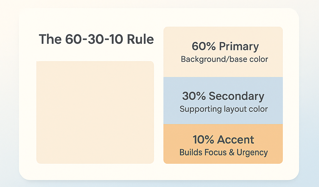
This ratio maintains clarity, avoids chaos, and establishes focus. When guided by the psychology of colors, the palette subtly directs attention while reinforcing emotion at every interaction.
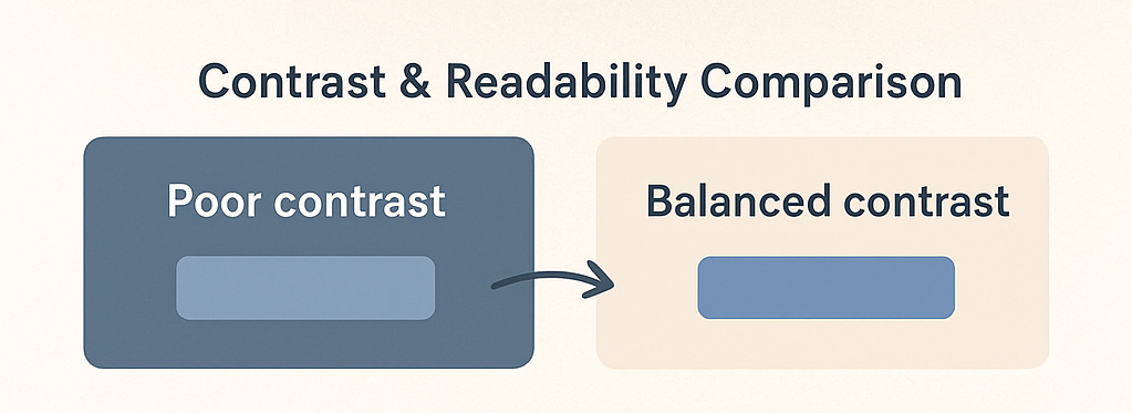
Contrast and Clarity: Improving Readability
Contrast is a cornerstone of user experience and accessibility. High-contrast pairings make text legible and improve comprehension. Designers often use light backgrounds with dark text for comfort, while accent tones emphasize hierarchy and importance.
However, contrast must remain visually balanced. Excessive contrast can strain eyes, while too little causes confusion. By applying color psychology principles, designers achieve clarity and depth, helping users focus easily and interact confidently.
Accentuating Calls-to-Action for Conversion Flow
Calls-to-action (CTAs) gain power from color psychology. Red and orange generate urgency, while green and blue build confidence and calm. These tones trigger intuitive emotional responses that lead users to click.
Additionally, spacing, shape, and contrast enhance CTA visibility. Designers must ensure consistency so that buttons look recognizable across pages. A well-chosen CTA color functions as a psychological cue, guiding users toward conversion without verbal instruction.
Creating Cognitive Flow Using Color Zones
Dividing a layout into color zones simplifies visual processing and strengthens engagement. Each section—header, body, footer—can carry a distinct hue to signal hierarchy and mood transitions.
This structure allows users to navigate effortlessly, sensing context from color alone. Moreover, it maintains aesthetic unity while supporting emotional rhythm. When aligned with the psychology of colors, such zoning enhances retention, comfort, and intuitive interaction across all devices.
Influencing Decisions and Conversions Subtly
Color choices influence user actions long before they realize it. Through color psychology, designers craft visual cues that guide attention, spark emotion, and inspire action. A button’s hue, a banner’s tone, or a form’s contrast can subconsciously drive conversions.
Moreover, colors tap into instinctive decision-making patterns. When design elements align with emotional triggers, users feel confident engaging with a site. Strategic use of color enhances conversion paths—subtly but powerfully. The right palette doesn’t just attract attention; it builds emotional confidence, helping users act without hesitation.
Testing Emotional Responses Through A/B Color Experiments
Testing is essential for precision. A/B experiments reveal how different color choices affect click rates, engagement, and retention. For instance:
- Red buttons often increase urgency.
- Green suggests confirmation or success.
- Blue boosts trust and reliability.
By studying these results, designers can identify which tones perform best for specific goals. Over time, A/B testing bridges creative intuition and measurable impact, ensuring that every color decision aligns with both emotion and data.
The Power of Urgency and Calm in Decision Design
Emotions drive choices faster than logic. Warm shades such as red and orange create excitement and urgency, pushing users toward immediate decisions. On the other hand, cool hues like blue and teal inspire calm and confidence during complex actions.
Balancing these emotional contrasts ensures comfort without losing motivation. By combining both energies, designers develop visually persuasive interfaces that maintain trust while prompting conversion. Thus, color psychology becomes the foundation of emotionally intelligent design that drives measurable outcomes.
Emotional Color Cues in Conversion Paths
Consistency of emotion across touchpoints builds trust. From headers to forms, colors should carry a predictable emotional tone that supports user confidence. Repeating the same accent hues for CTAs and links creates familiarity and ease.
Moreover, emotional color cues act as behavioral reinforcers. They tell users when to act, continue, or pause—without extra text. When designers use the psychology of colors intentionally, every shade contributes to a seamless, conversion-friendly narrative.
Behavioral Insights: Applying Color to Nudge Action
Understanding user psychology allows color to act as a subtle motivator. For example:
- Orange energizes impulsive behavior.
- Green reinforces progress.
- Blue sustains attention through calm assurance.
Integrating these insights transforms static designs into behavioral systems that influence subconscious decision-making. When aligned with user intent, color psychology becomes a quiet persuader, moving users from curiosity to confident action naturally.
Bridging Cultural Meanings: Designing Beyond Borders
Colors don’t speak a universal language—they shift with context and culture. Through color psychology, designers learn that emotional meanings vary greatly across regions. For instance, white symbolizes purity in Western culture but represents mourning in some Eastern societies. Understanding these differences helps avoid confusion and fosters inclusivity.
Therefore, designers must study cultural symbolism before creating palettes. By respecting emotional associations, brands ensure that their designs feel authentic and culturally relevant. This thoughtful approach strengthens global connection and makes every color decision an act of empathy rather than assumption.
Cultural Symbolism and Global Perception
Cultural context defines how users perceive colors emotionally. Red conveys fortune and joy in one culture but may symbolize danger elsewhere. Similarly, green represents growth or faith depending on region and history.
Recognizing these symbolic contrasts enables brands to communicate with emotional precision. When aligned with local understanding, color psychology turns design into a universal yet sensitive visual language, helping brands feel approachable worldwide.
Local Adaptation Without Losing Brand Essence
Global brands often face the challenge of staying consistent while appealing locally. The key lies in maintaining core brand colors while slightly adjusting tones or supporting hues per market. A strong visual framework can evolve without losing its emotional signature.
This flexible consistency keeps recognition intact while respecting audience preferences. By merging global identity with local nuance, designers use the psychology of colors to express both unity and diversity in digital experiences.
Emotional Inclusivity in Color Design
Inclusive color design respects more than accessibility—it honors emotional and cultural diversity. Using balanced tones that appeal across regions ensures a wider emotional reach.
Designers can achieve inclusivity by applying neutral foundations complemented by culturally adaptive accents. Furthermore, inclusive palettes project warmth, belonging, and emotional safety, helping users feel respected and connected across cultures.
Adapting UI for Cultural Color Expectations
Different cultures perceive UI colors differently. In some regions, vibrant hues show energy and optimism, while in others, they may seem overwhelming. Such variations influence how users emotionally respond to interfaces.
To design globally, teams should research local reactions before finalizing palettes. When guided by color psychology, these insights ensure that visual experiences remain emotionally engaging, culturally appropriate, and universally relatable.
Increasing Accessibility and Readability
Color accessibility isn’t just about visuals—it’s about inclusion and usability. Through color psychology, designers can create digital spaces that feel both beautiful and functional for all users. When color contrast, brightness, and tone are carefully balanced, users with visual differences can interact with ease.
Additionally, accessible design improves brand reputation and user trust. By combining emotional appeal with technical precision, color decisions become more human-centered. Many teams now integrate these practices into hire front-end developer strategies to ensure interfaces are not only aesthetic but also empathetic and inclusive.
Contrast and Legibility in Interface Design
Readable text depends heavily on sufficient contrast. Dark-on-light combinations remain the most accessible, yet color psychology helps refine how contrast feels emotionally. Too much contrast creates strain; too little blurs focus.
Therefore, designers must aim for balance that enhances readability while maintaining visual warmth. When colors are selected with psychological intent, every sentence becomes more inviting, improving both comprehension and comfort for every viewer.
Color Accessibility for Users with Visual Impairments
Designing for inclusivity means anticipating diverse visual experiences. Around 8% of men and 0.5% of women experience some form of color blindness, which alters how they perceive hues.
To accommodate these users, designers should:
- Avoid using color as the only form of communication.
- Use texture or icons alongside color cues.
- Maintain high brightness contrast for key elements.
These methods, guided by color psychology, ensure that designs remain functional and emotionally clear, regardless of visual ability.
Reducing Cognitive Load Through Color Structure
Color organization can simplify how users absorb content. When tones separate sections, they subconsciously group related information, improving understanding.
By applying psychological color mapping, designers reduce the mental effort needed to process layouts. This makes the overall experience smoother, faster, and more engaging. As a result, readability and emotional flow improve together, helping users stay connected longer.
Designing Calm Interfaces for Long-Term Engagement
High-contrast, overstimulating color schemes can exhaust users. Calmer palettes promote focus, comfort, and readability—especially for long sessions. Soft hues like pastel blues and neutral grays create relaxed environments where users feel at ease.
Furthermore, color psychology supports this calm design approach by balancing stimulation and rest. When designers craft serene visual atmospheres, they reduce friction, allowing users to browse naturally and engage for longer periods.
Boosting Emotional Engagement and Retention
Colors can make users feel emotionally connected long after they leave a site. Through color psychology, designers craft digital environments that evoke emotion, build curiosity, and foster connection. When people feel something, they’re more likely to stay, return, and trust the experience.
Moreover, emotion-driven design strengthens brand memory. Each hue tells a story that users subconsciously remember. By combining emotional storytelling with advanced AI solutions for retail or digital interaction tools, brands can create lasting impressions that go beyond visuals—turning every interface into an emotional experience.
The Science Behind Emotional Retention
Emotional memories are stronger than rational ones. When users associate colors with positive experiences, they naturally return. For instance, warm colors can spark enthusiasm, while cool tones encourage calm reflection and trust.
By using color psychology strategically, designers build emotional anchors that make websites feel memorable. This psychological attachment transforms occasional visitors into loyal advocates who recognize the brand instantly.
Creating Mood Consistency Across Interfaces
Mood consistency ensures users feel emotionally aligned across all touchpoints. A coherent color palette helps maintain emotional stability, reducing friction and confusion. When colors shift unpredictably, users subconsciously feel detached or uncertain.
Designers can use the psychology of colors to create smoother transitions and harmonized tones. By sustaining mood consistency, websites not only look cohesive but also maintain a comforting emotional rhythm that keeps users engaged longer.
Using Color to Reinforce Content Emotion
Content feels more engaging when its emotional tone matches color cues. For instance, motivational sections might use vibrant tones, while educational content benefits from softer, grounded hues. These visual-emotional pairings amplify message clarity.
Furthermore, aligning colors with content purpose enhances focus and comprehension. When the visual language supports emotional context, readers experience deeper connection and retention. This practice turns reading into a visual dialogue that sustains attention naturally.
Encouraging Loyalty Through Emotional Design
Emotional design nurtures brand loyalty by creating positive, repeatable experiences. When colors reflect empathy, optimism, or trust, users are more likely to identify emotionally with the brand.
Moreover, color consistency in newsletters, apps, and web interfaces reinforces identity and reliability. Through color psychology, designers ensure each visit feels familiar yet fresh—encouraging long-term engagement built on emotion, not repetition.
Conclusion: Turning Color Psychology into Lasting Design Impact
Color is more than decoration—it’s a psychological language that defines emotion, trust, and perception in every digital experience. By mastering color psychology, designers create visual systems that resonate on a deeper, emotional level. Every tone, contrast, and gradient becomes a tool for storytelling and connection.
Moreover, as web design evolves, the psychology of colors continues to shape how brands communicate and users respond. Teams that combine emotional intelligence with innovation can design interfaces that not only perform well but also feel meaningful. With experience in Odoo warehouse management and digital experience engineering, modern designers can transform color from a static element into a strategic force for engagement, clarity, and long-term retention.
Frequently Asked Questions (FAQs)
1. What is color psychology in web design?
Color psychology in web design is the study of how colors influence perception, mood, and behavior. It helps designers create visual experiences that evoke emotions, drive engagement, and support a brand’s message. By understanding the psychology of colors, designers can turn visuals into emotional storytelling tools.
2. How does color psychology affect user behavior online?
Colors guide users subconsciously by creating emotional triggers. For instance, blue builds trust, red encourages action, and green promotes calmness. Through this connection, color psychology influences how users navigate, click, and make decisions on a website.
3. Why is color consistency important for branding?
Consistent color use strengthens recognition and emotional memory. When users see the same palette across platforms, they associate it with familiarity and reliability. The psychology of colors supports this by reinforcing emotional continuity and making the brand feel trustworthy and cohesive.
4. Can color psychology improve website accessibility?
Absolutely. By combining color psychology with accessibility standards, designers can ensure readability, contrast, and inclusivity for all users. Accessible palettes not only make content easier to view but also create emotionally comfortable experiences for diverse audiences.
5. How can designers choose the right color palette for their website?
Designers should consider target audience, cultural context, and emotional goals. Using color psychology as a framework helps match hues with brand personality and user expectations. Testing and iteration ensure that the final palette feels visually engaging and emotionally aligned.
6. What mistakes should be avoided in applying color psychology?
Overuse of bright tones, poor contrast, or inconsistent palettes can confuse users. Also, ignoring cultural variations may lead to misinterpretation. Designers should apply color psychology thoughtfully—balancing emotion, clarity, and accessibility for a seamless visual experience.